Roaster's Roost
SCHOOL PROJECT
Objective
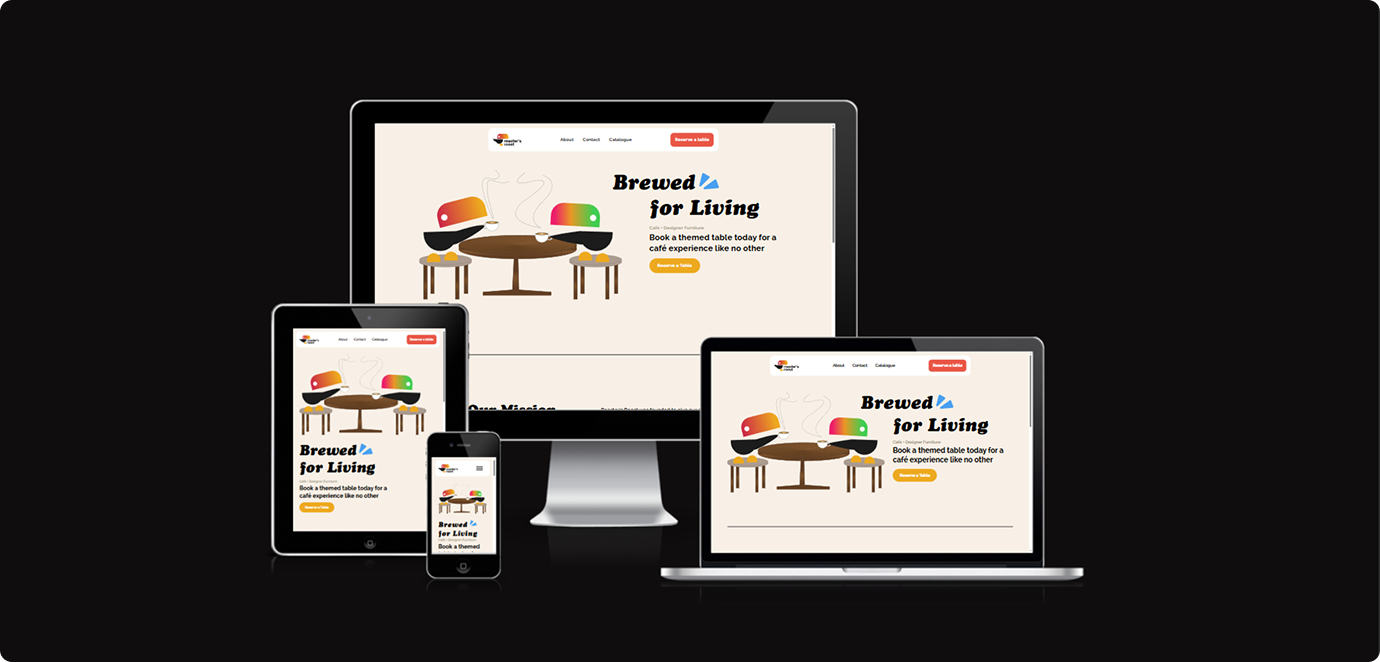
Roaster’s Roost is a project that’s goal was to create a front end website that simulated a full checkout experience and communicated a consistent brand on the entire site. The second objective of this project was to learn JavaScript and use it to enhance certain components. The website was to showcase how Roaster’s Roost offer’s a combo of furniture and coffee to enjoy in a café space.
Skills:
HTML
CSS
Javascript
Prototyping
Timeline:
Oct - Nov 2025
Tools:
Figma
VSC
Chrome DevTools
Clip Studio Paint
Github
Members:
Desmond Chen
Exploration
1.
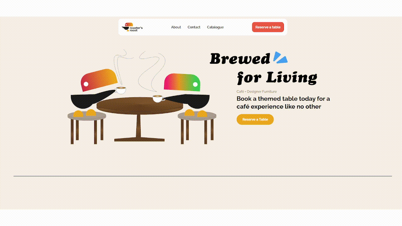
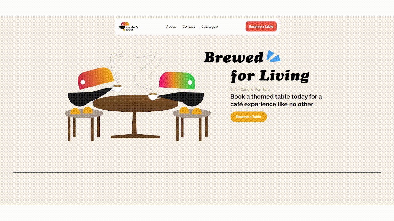
My partner and I wanted to combine previous company ideas that we had developed. Furniture and coffee seemed like an odd combination at first but we imagined what furniture and coffee offers to a person in terms of an experience. It was important to embody a brand to our idea that reflected our concept to experience different spaces while enjoying different flavours of coffee.
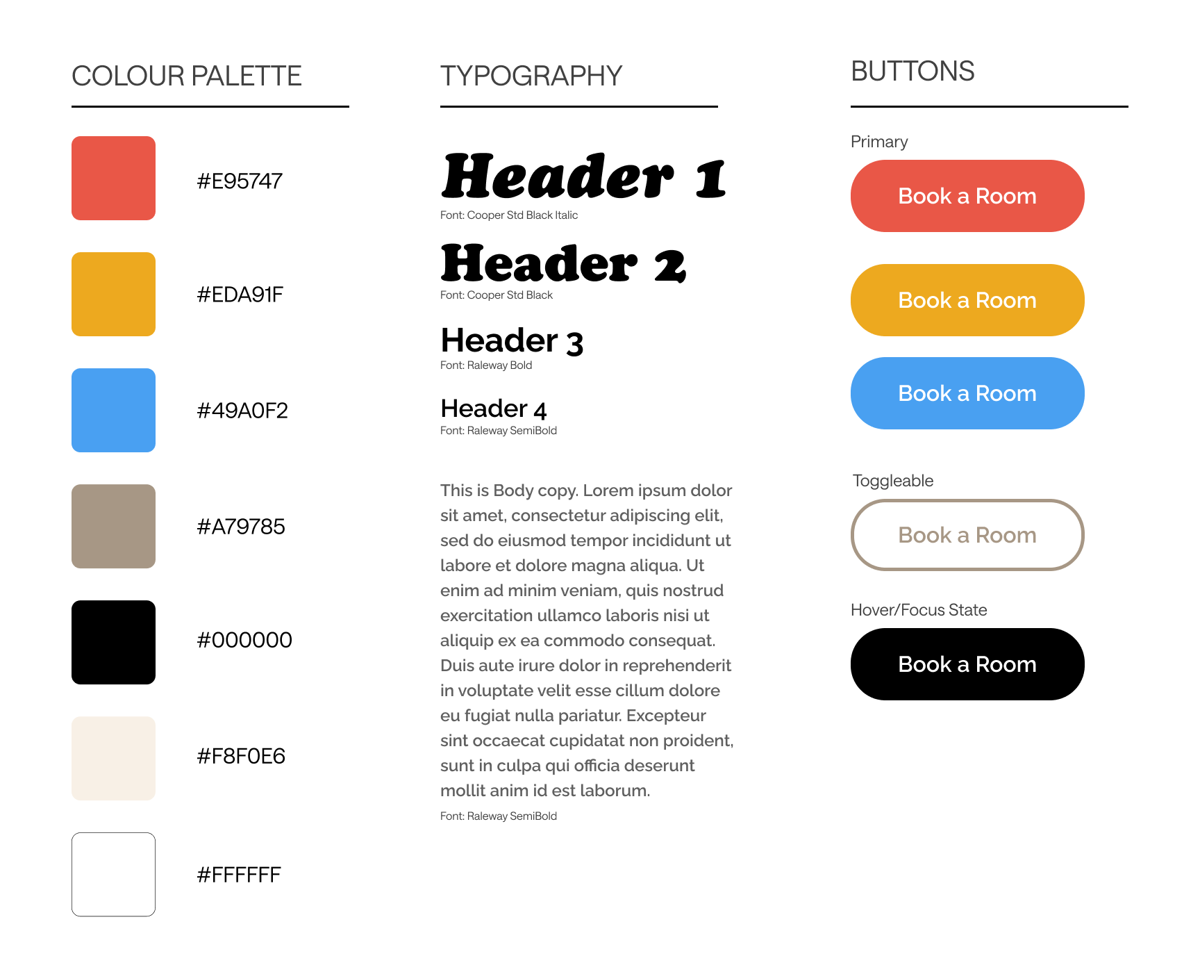
My exploration began by taking inspiration from a lot of retro and softer aesthetics. This included colours that were either pastel or included more primary colour combos. The first focus was the logo of for the website. At the beginning of this process, we had planned for this fictional company to be called Möbel Roasters. My partner believed that something like a cute mascot would benefit in showcasing a cozier friendlier experience. After looking at some different animals we liked the look of a toucan, and how colourful their beaks appear in contrast to the rest of their body. This shifted the direction of our logo, how I was developing the look, and resulted in a name change to Roaster’s Roost.
Components and Layout
2.
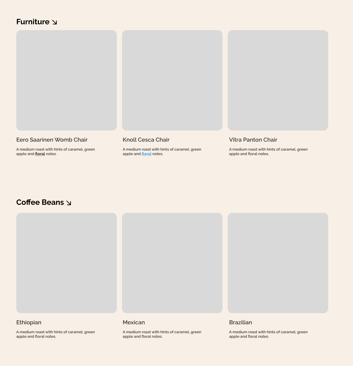
The process of this design, involved actively trying new designs and decisions in active web development, or if it was something more specific I worked in Figma to iterate through ideas. The next step for me was to develop what the buttons of the site would consistently look like as well as the overall layout of our planned catalogue. Considering that we wanted the final result to appear as soft and friendly I believed a more rounded look for the buttons, and images would be best. The style and typography was chosen to embody a warm welcoming bouncy feel.
Development
3.
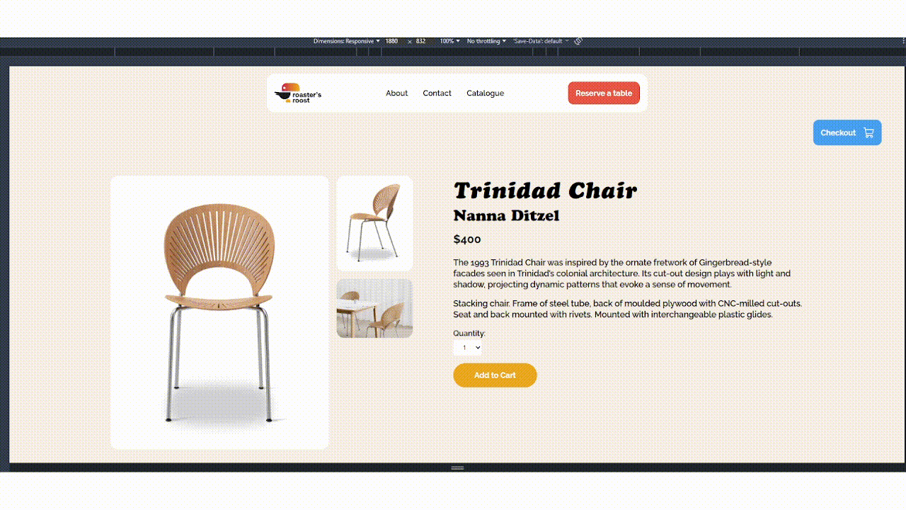
The main pages that I was in charge of creating were the renting a space page, and the individual listing page for a selected item. This project was a learning experience for me to use JavaScript. A challenge I faced was figuring out how to keep a button selected so that it showcased to the user that their selection had been kept. The solution I found was using JavaScript to keep an active state on the time slot buttons and toggling it so that it stayed selected when the user presses the reserve button.
Result
4.
By the end of this project I had accomplished making a friendly, welcoming website that branded a new experience and helped me develop my JavaScript skills, and learn more about developing actively using web development tools.